We Promise These Lines Mean Something: New Audio Testing Method
Headphone testing isn’t one-size-fits-all, so we added more setups, real-ear data, and clearer visuals to better show how things might actually sound.
Frequency response graphs have long been the cornerstone of headphone reviews. They show how a pair of headphones reproduces frequencies (bass, mids, treble) across the audible range. But while these graphs can look scientific and objective, they haven't always told the full story.
We’re exploring a way to present headphone testing data that we hope is more intuitive, more consistent across different setups, and more informative for potential buyers. Here is a quick introduction to our new testing method and data visualization which we will delve deeper into in the near future.
Our new test setup
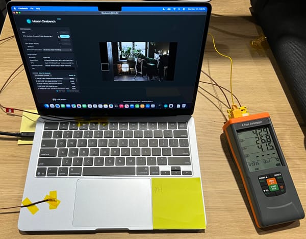
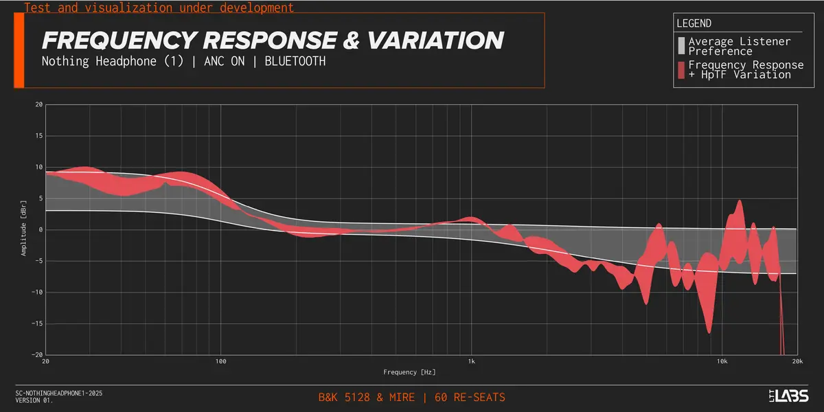
Each headphone is tested using multiple measurement setups. These include artificial Head And Torso Simulators (HATS) like the Brüel and Kjær 5128-C, Brüel and Kjær 4128C, as well as microphones placed in real ears (MIRE). This variety helps us account for differences between rigs and capture how headphones behave across different ear shapes and fits.
We start testing the headphones using their default equalizer settings, as they would sound out of the box. A frequency response curve is generated by playing sine sweeps and noise patterns though headphones while measuring with the HATS or MIRE. For each test setup, we take multiple passes, removing and repositioning the headphones between each pass to reduce the impact of slight placement differences. For example, we performed 60 individual measurement passes for the Nothing Headphone (1).
The problems with traditional measurements
In our earlier testing, as covered in this article, we relied on a single test rig and displayed frequency response plots without accounting for cross-rig variation or listener fit differences. While that gave us a starting point, we quickly realized it was not telling the full story. That brings us to some of the fundamental problems with traditional headphone measurements.
Most traditional frequency response plots are what we call “raw” measurements. They show how a headphone behaves on a specific measurement fixture (or simply a “rig”), without accounting for quirks of human hearing or differences between rigs. Below we'll cover some of the main issues with these traditional plots.
Your brain struggles with raw graphs.
When comparing two lines that are close together, especially when they’re curving upward in parallel, it's surprisingly hard to judge how different they are. This is a known perceptual limitation in humans according to a study done by Cleveland and McGill[1].
Take a look at the nine graphs below (Figure 26), adapted from their study. Each one shows two slightly different curves.
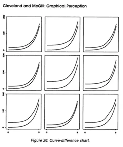
Try to precisely describe how they differ. Seriously, give it a shot.
Not so easy, right? Even though the differences are real and measurable, it’s hard to judge them visually and make precise observations when the lines are close together and curving in parallel.
Now look at the next set (Figure 27). These contain the exact same data, but this time you’re looking at the difference between the lines directly. Much easier to see what’s actually changing.
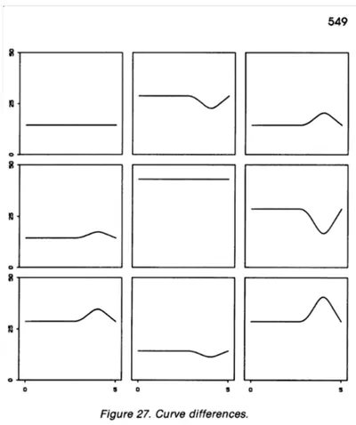
For each point along the frequency axis (say, at 1000 Hz), you subtract the decibel (dB) value of one curve from the other. So instead of showing both lines on top of each other, you show a single new line that represents how far apart they are at every frequency.
This “difference curve” makes changes much easier to see because:
- A flat line at 0 dB means both curves are identical.
- Any bumps or dips in the difference curve directly show where and how much the two responses diverge.
So in Figure 27, instead of overlapping two nearly identical squiggly lines and asking your brain to compare them, you're just looking at the difference clearly shown as one line which is much more intuitive.
Targets are often one-size-fits-all.
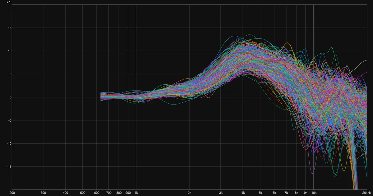
Popular benchmarks like the Harman target (developed by Dr. Sean Olive) represent an average listener preference, but people’s ears and audio tastes vary widely. People’s ears will all measure slightly differently, and in Harman's own research there are several other targets that were preferred equally to the Harman target[2]. There’s no single “perfect” sound for everyone.
The following graph that our friends at Headphones.com generated from various research papers and data bases contains measurements from microphones in real people’s ears[3]. Each curve is from a different person and illustrates the possible variation in perception to the same sound.
Using a preference band instead of a single line
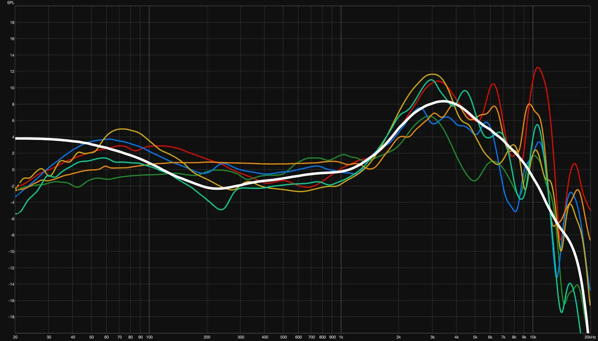
We also display a target band, rather than a single target line. This target range (in white/grey on the very last figure of the Nothing Headphone (1)) is constructed using data from Dr. Sean Olive’s Harman research[2][6] and reflects the spread of preferences among listeners[6]. Closer to the middle of the target range, more people are likely to enjoy that sound, while the edges represent more specific tastes (like bass-heavy or treble-heavy preferences). Although, it is worthwhile to note that there are some areas where the preferences deviate from the middle of the target range. This is a methodology that was initially explored by The Headphone Show.
Shown below is the raw Harman target from 2018 in black alongside several other frequency response curves that were found to be equally preferred[2]. This is just one of the many data sets from the Harman papers that we used to construct the target band. Visualization provided by Griffin Silver of Headphones.com.
All together, this means:
- The “parallel line illusion” disappears, because the parallel lines themselves disappear.
- You can more directly compare measurements taken on different systems.
- You can see how much frequency response variation to expect, even before putting the headphones on.
These changes in practice
This visualization of the frequency response and variation of the Nothing Headphones (1) is an example of the current method of visualization that we have developed and there will likely be changes and improvements to come soon.
Here is the reference list for all of you who want to explore the research we mentioned:
- Cleveland, W. S., & McGill, R. (1984). Graphical perception: Theory, experimentation, and application to the development of graphical methods. Journal of the American Statistical Association, 79(387), 531–554.
- Olive, S., Welti, T., & Khonsaripour, O. (2018, May 14). A statistical model that predicts listeners’ preference ratings of around-ear and on-ear headphones (Paper No. 9919). Audio Engineering Society 144th Convention.
- The data that was used to generate the figure came from the following studies and databases:
- Alon, D. L., Warnecke, M., Ben-Hur, Z., Calamia, P., Amengual Garí, S. V., & Clapp, S. W. (2024, August 5). A high-resolution HRTF database collected at AVAR 2022. Audio Engineering Society.
- Algazi, V. R., Duda, R. O., Thompson, D. M., & Avendano, C. (n.d.). The CIPIC HRTF database [Conference paper]. CIPIC Interface Laboratory, University of California, Davis.
- Brinkmann, F., Dinakaran, M., Pelzer, R., Grosche, P., Voss, D., & Weinzierl, S. (2019, September 6). A cross-evaluated database of measured and simulated HRTFs including 3D head meshes, anthropometric features, and headphone impulse responses. Audio Engineering Society.
- Watanabe, K., Iwaya, Y., Suzuki, Y., Takane, S., & Sato, S. (2014). Dataset of head-related transfer functions measured with a circular loudspeaker array. Acoustical Science and Technology, 35(3), 159–165.
- Møller, H., Sørensen, M. F., Hammershøi, D., & Jensen, C. B. (1995). Head-related transfer functions of human subjects. Journal of the Audio Engineering Society, 43(5), 300–321.
- Völk, F. (2014, May 6). Inter- and intra-individual variability in the blocked auditory canal transfer functions of three circum-aural headphones. Audio Engineering Society.
- Olive, S., & Welti, T. (2012, October 6). The relationship between perception and measurement of headphone sound quality (Paper No. 8744). Audio Engineering Society 133rd Convention.
Here is a list of all the products we mentioned: